Whatever You Do, Don’t Quit
Greetings, fellow developers and aspiring Git masters!
It’s time for another update on Gitonium.
When I started this project a year ago, I said that merge conflicts was a central problem I wanted to solve. That was always the plan.
Before I can start solving those problems, I need to build many components. I need code that speaks to the Git repository. I need views to display changes and diffs. I need to show code changes over time and reveal similarities, patterns, and repetitions.
— Steffen (@starv) April 11, 2022
Well, I’m happy to say I’ve reached that point. 🎉
I now have a smooth little Git client with all the components needed, plus some specially designed touches.
When you have a family with small children and a full-time job, building something like this on the side takes time, and you must not wear yourself out, either. Anyway, things taking time is fine - As long as you enjoy the ride, keep going, and don’t stop, you’ll get there 100%.
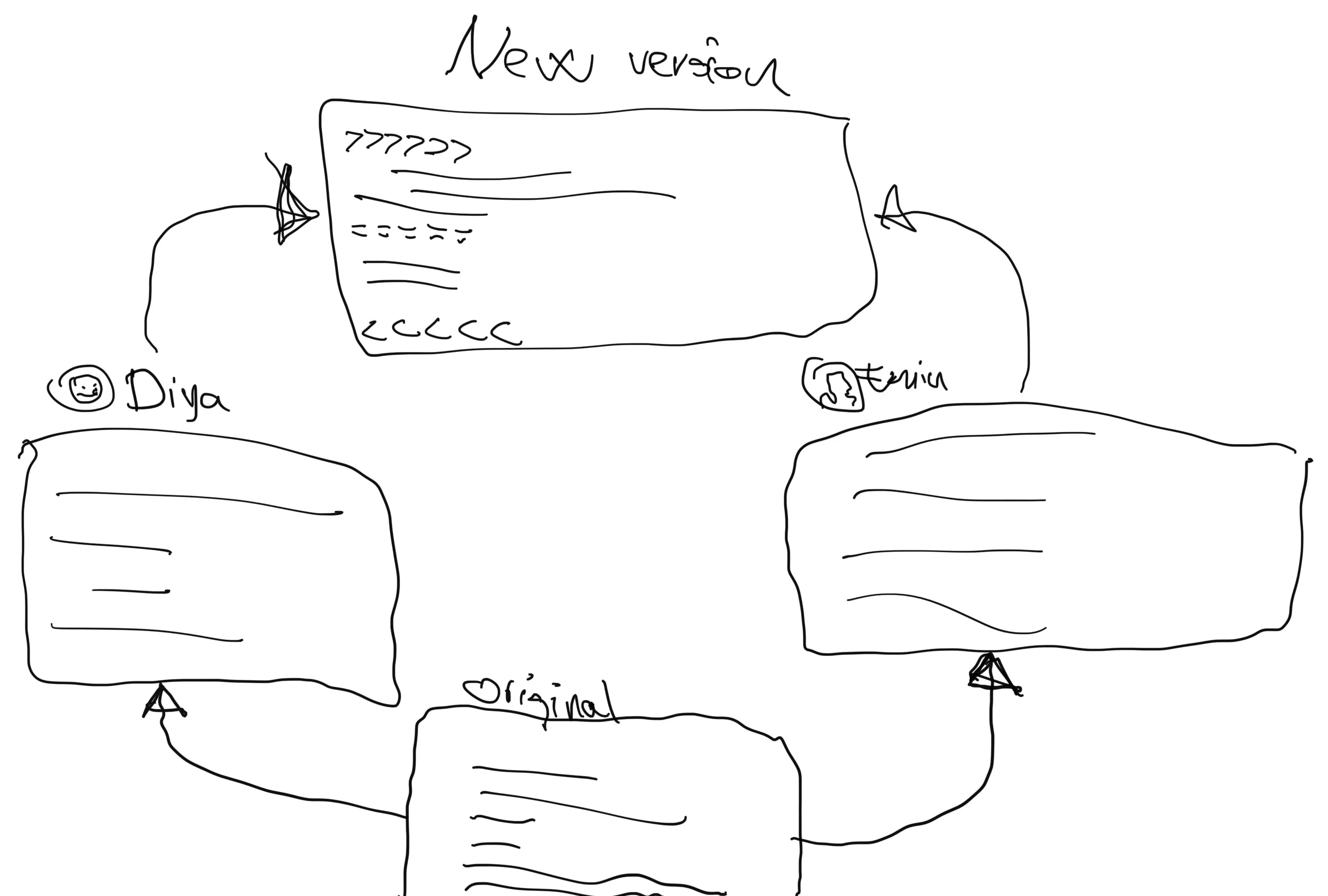
Around a year ago, I whipped out my Apple Pencil and drew this doodle of what kind of UI I thought I would need to make life easier when trying to solve a git merge conflict.

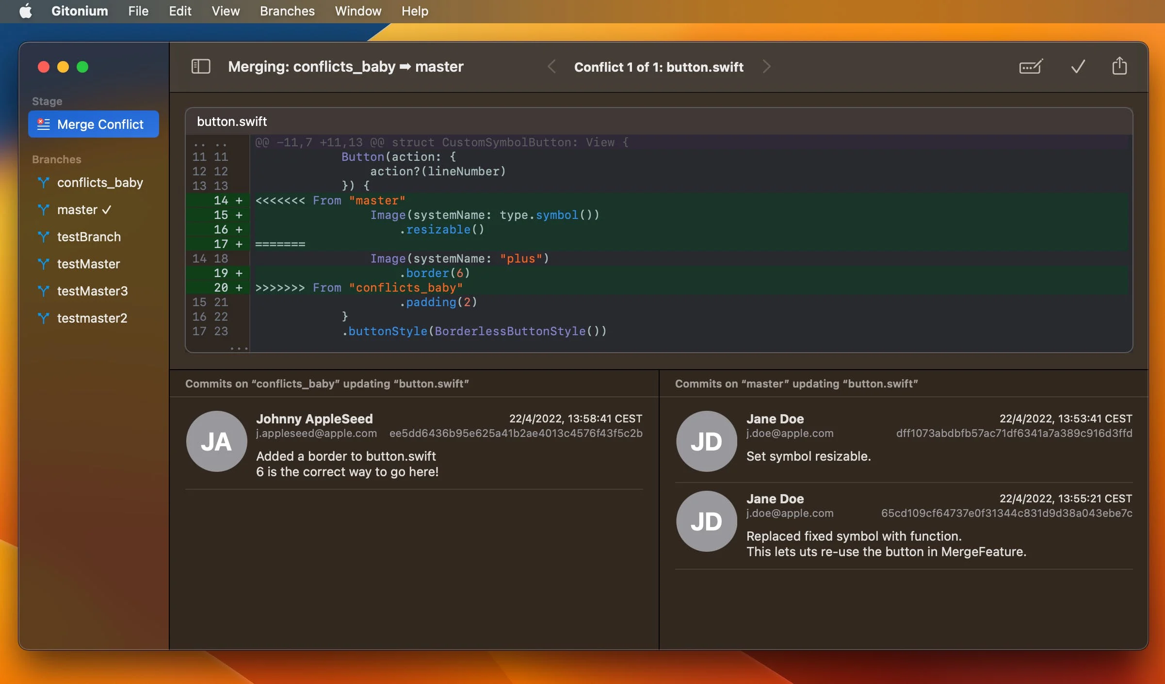
Based on this thing of beauty, I started building a working version a few weeks ago. Here is a sneak peek of what it looks like:

In this picture, you see my test repo during a merge conflict. As the header explains, we are in mid-merge of a branch called “conflicts_baby” going into “master,” hence the arrow. In this example, we have a conflict in one file, “button.swift”. (I know, ignore the lowercase “b” 🙀.)
Anyway, if there are multiple conflicts, you can page between them here. The diff shows you the conflict, with annotations telling you which branch each change is coming from. Typically, a Git diff will label one side as “HEAD,” which always confuses me. I decided to improve on that.
Below the diff are two columns of commits. These contain only the commits that changed something in this exact file, going back only as far as is relevant for this merge. When considering the merge process as moving from left to right, the left side represents the changes going into the right side. You can click on each commit to see its changes in a popover.
This UI makes what is going on extremely clear:
- We are merging “conflicts_baby” into “master.”
- There is a conflict in “button.swift”
- It shows you the actual problem.
- The left changes came from “conflicts_baby” and the right ones from “master.”
- You can clearly tell who changed this file, when, and what they did on either side.
On the right side of the toolbar is an “Edit” button, which opens this file in whatever your default editor is, so you can make the necessary changes, and next to it is a button to mark this conflict as resolved. When no more conflicts exist, the merge is completed, and you are done.💪
On the far right is an emergency Share button, and the idea is to let you share this with whoever worked on any of these commits, so they can get a similar overview and help you out.
I’ve yet to see another tool that puts all the information you need right where you need it. One always has to do - almost a forensic investigation to figure all this out. No magical incantations on the console or git blame digging are needed. This is the tool I’ve always wanted. This saves me time, alleviates my pain, and makes me feel confident about solving conflicts without the risk of regressions or stupid mistakes.
I’m releasing a new TestFlight version of Gitonium today, but it lacks the merge feature, as I’m still polishing it. However, I have done a bunch of optimizations in this build regarding speed and correctness. It works much faster on large repos, and I’ve fixed some bugs in the syntax highlighting, plus a redraw issue that irked me when the view was laying out the line number ruler.
After I added “Checkout” and “Create Branch” in the previous version, some of you requested a Delete Branch menu option, and I’m happy to oblige. Pushing and pulling to remotes will be coming soon, too.
Let me know what you think, and as always, please suggest improvements if you have any.
How to test Gitonium
If you haven’t already, you can install the latest Gitonium Beta using this TestFlight link: Update: Gitonium is now on the App Store
I hope you like this update, and please keep suggesting things for me to improve (reply to this email).
Thanks for following along!
-Steffen.